25 February 2012

Degas and the Nude

Saw the Degas exhibit at the MFA a couple times and know what is awesome there? This piece:

After the Bath, Woman with a Towel


The show closed on February 5th, but happily, this piece is owned by the Fogg Art Museum at Harvard so anybody in the Boston area can go and visit it there.
The drawing was done with pastel on blue-gray wove paper and is 27 7/8 x 22 9/16 inches.
There is so much color, it is hard to even get the full sense of it from just seeing the image, you really need to go and visit it.  Completed somewhere between 1893 and 1897, I was unprepared to see such vibrant colors used so long ago.  It really does feel like long ago, so much in art has happened since then, but really, it should be no surprise.  Wikipedia says that the first time the French word “pastel” was used was in 1662. It is so hard to get a true feeling of time over the course of history.  Anyway, bright color just seem like such a contemporary idea, what a refreshing thing to be wrong about.
I was also impressed by all of the vertical and horizontal lines going on in Degas’ drawings throughout his work.  So much structure, it aligns with the industrialization that was going on at the time I suppose, but it speaks to pixels now.    


Other pieces I loved:


After the Bath, Woman Drying Her Chest
Made around 1890
Pastel on tracing Paper
The Courtland Gallery, London


Woman at her Bath
Made around 1895
Oil on canvas
28 x 35 inches


Woman Seated on a Bathtub, Sponging her Neck
Made around 1895
Oil on paper
Musee d'Orsay, Paris


The show also had many pieces by other artists who served as both inspirations and peers to Degas.  One of the pieces that I just have not got enough of yet is a painting by Picasso.


Nude on a Red Background
Oil on canvas
Musee de l'Orangerie, Paris

23 February 2012

Art in Life via Instagram


Seeing art in everyday life is shared and encouraged via the instagram app for iphone.  This is sort of a commercial for them and I'm sort of fine with that.  It is free app that makes quick and easy artmaking accessible for those with the tools (an iphone or ipad).  There are boundaries and freedoms within the mechanics, which is usually a good equation, and seems to be working out pretty well for them and us.


The user is forced to use a square frame, immediately requiring more of a mental focus of the them by taking the typical rectangular cropping device out of play.  Because of this, composition quickly becomes key before you even get into the color adjustments as one cannot thoughtlessly click (or tap) away.


There are 17 filters to choose from to send the photo through if you don't want to keep the original color balance.  There is a black and white filter along with variations that lean towards the respective primaries and also some that will give a vintage look to the shot.


Another app that has come out to help get creative with your photos is Ditpic, which unlike Instagram is not free but pretty cheap, I think it is 2 or 3 dollars.  Using Ditpic the user can photo collage away with templates that have been set up.  There is also the option of altering these templates by dragging the lines between the photos all over the place to change the shape of each piece of the puzzle.


It is so easy to get carried away documenting every second of life, and I'm pretty much doing that all the time.  These apps slow me down just enough to really think about what is happening, and what I want to happen, visually.  
What am I trying to emphasize?  Just above, the orange, and below the glass.  Within those focal points, I'm playing with the contrast between these things and what is hanging out in the rest of the frame.  I can make these decisions very quickly, choose the appropriate filter to bring out the warms, cools and contrasts I'm looking for and share away.


I truly believe that art is anywhere you want it to be and that anybody can make it if they want to.  This app helps us unselfconsciously share the various visual stimuli we get throughout our day to inspire ourselves and our friends.

By the way, I got my Dana Schutz If the Face Had Wheels book in the mail and it has pretty good forward, a great interview, photos of paintings that were not in the show I saw (which rocked) but the photo of painting Licking A Brick was not included!! wth?!  That is the ONE painting that I was anxious to get to it's page as I was flipping through.  Why is there no documentation of this piece online OR in this book??

17 February 2012

If the Face Had Wheels


While in Miami I had a little time to pop into the Miami Art Museum where a Dana Schutz exhibition was on display.

I don't know exactly when I became familiar with Schutz's work, probably around 2008 when I went with Meghan Dinsmore to see her speak at Boston University as a part of their Contemporary Perspectives Lecture Series.  I just found a link to the talk here if you are interested in seeing it. It has been really good for me to go back and flip through this talk again, she sounds sweet.  What I remember from the talk is being annoyed with the simplicity of the stories of her paintings, but as I continue to look at her work it is now, of course, that simplicity which keeps bringing me back.

Cover for the catalog (that I am ordering tonight!)


"If the Face Had Wheels" was organized by Neuberger Museum of Art, Purchase College and State University of New York.  I checked out the Neuberger Museum of Art website to see what they had to say about her paintings and it was just what I was hoping for.  A quote that summarizes the obvious about Shutz's work, which is TRUE, and I UNDERSTAND why it is talked about all of the time, but can we not move on?  The quote is, "The subjects of Schutz's paintings spring from an absurdist sensibility as she invents imaginary stories or hypothetical situations that are bizarre and impossible, yet oddly compelling."  This line of thought has been so thought about that I've decided to NOT think about it over the past few years, which has led me to not bother keeping up with her work.  Yes, Schutz's work IS all of those things, and there is a lot to think about and enjoy there, but there is this whole other thing that I haven't heard enough about and didn't even know existed until I saw this show.  How am I just finding out about her Tourette's Series?!  Apparently Dana Schutz has things going on other than telling hypothetical stories and that rocks because her application of paint alone makes me want to roll around on one of her wet canvases, never mind a concept that I can get into as well. 
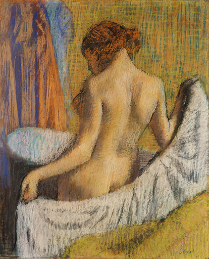
Carpenter 2010
Oil on canvas
50 x 72 inches

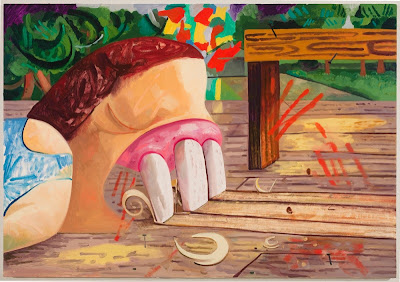
The painting I really wanted to show here is "Licking a Brick" from 2011 which is owned by Nina Grill.  Who is Nina Grill and where is there a photo of this painting?  Well I'll get a photo of when my catalog is delivered I suppose.
Much like in "Carpenter," "Licking a Brick" sends the viewer a direct snapshot from Schutz's brain of an impulse she has had.  I've always been intrigued by these impulses, Where do they come from? What do they mean? How much do I really want that?  I equate Schutz's impulses to scrape wood with her teeth and licking bricks with my desire to throw myself over the upper level railing at the mall and chuck my phone into the Biscayne Bay during an enjoyable conversation.  I also often think about steering my car off the road while on the highway.  These impulses always come at times when I am absolutely chilled out, I dont really want these things, I'm just impulsively curious about the experience and it kind of freaks me out.  What if my action followed through as quickly and unexpectedly as my curiosity arrived?  I love Schutz's ability to capture these fleeting thoughts into these sometimes gigantic paintings.  They are simple and quick thoughts that she manages to translate into complex and time consuming objects while not changing their impulsivity a hair.

Some of the paintings that gave my eyeballs a place to pack up and move out of my head to were:

The Breeders 2002
Oil on canvas
84 x 90 inches
Collection of Gagosian Gallery

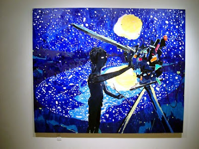
Chicken and the Egg 2003
Oil on canvas
75 x 90 inches
Collection of Diane and Robert Moss
Notes I took about Chicken and the Egg while at the museum pretty much sum up my feelings about it, "Blue - Fucking Blue. Unapologetic!" Also, the pattern of negative space as stars in the sky and their reflection in the water below is kind of awesome too; over half of the painting is spots!

Her Arms 2003
Oil on Canvas
Collection of David Teiger
This is a scan from some promotional paper I got at the museum; it does no justice to the actual color of the painting.  The painting has got to be at least 6 feet tall; I will update the info when I get my book on the show.  Things I loved about this painting cannot be seen in photos, thick paintings just do not photograph well.  In the areas with thick paint you can see so many different colors in each stroke, it gives the marks a greater presence of time in the history of the painting.  And the hand on the left of the painting is structured so well and it is an entry point into how thoughtful all of the marks are.

Gouged Girl 2008
Oil on canvas
Collection of Carlos and Rosa de la Cruz
Some of the text that went along with this piece in the museum referenced Rene Magritte's "This is Not A Pipe" painting.  I can't totally get on board with that.  Yes, this is not a picnic and this is not a real girl or real anything else, but I just find this painting to be more about pattern, color and experimentation -with a still life as the vehicle for these things, than I see the edited still life as the actual point of the whole thing.
I loved the play of thick and thin paint in this piece.  The orange splash of color you see between the girl and the bottle is one of the thinnest areas in the piece although it appears to be additive as far as color is concerned.  That bright orange is such an intense color that along with its thin application gives the appearance of beaming, color as it's own light source, I love it.  
Another area of interest I found was with the flesh colors on the girl and the watermelon.  The color used is pretty similar and works as one color compositionally, but in reality it is a cool tone used in the fruit.

Schutz is holding it down and I'm glad that I got back on board with that.


12 February 2012

Wynwood District

I recently had the opportunity to spend an afternoon checking out the Miami art scene.  I had no idea how great Miami is doing.  My friend and painter Anne Harney picked me up in South Beach and we headed about 10 minutes East, over the Biscayne Bay, to the Wynwood District where Anne lives amongst an astounding amount of artwork.  Hanging out in the Wynwood district is much like walking around a huge contemporary art museum without having to walk through one doorway.  Street art and graffiti ranging from intricate tags and stencils to all out murals covering the walls.


Stelio Faitakais
Artist's Allegory of Florida
Wynwood Walls

Anne and I had lunch on the patio at Wynwood Kitchen and Bar


There are Shepard Fairey murals inside and outside as well an amazingly tall sculpture by David BenjaminSherry that is visible from both inside and outside of the restaurant, among other artworks.  Check out the restaurant’s website for more photographs of these and other pieces they have in house.


06 February 2012

Oil on Paper

Well, 2011
Oil on Paper
10.5x12"

Here are a few of the images that I am currently working with in preparation to go up onto my website.  I've begun the color correction process to get the images identical to the paintings.  They are all just about perfect.  From there I will crop and square them to have a clean looking image.  


Earth Hole in Red, 2011
Oil on Paper
10.5x12"


Landscape with Grayscale, 2011
Oil on Paper
10.5x12"


Markers, 2011
Oil on Paper
10.5x12"


Primary and Gray, 2011
Oil on Paper
10.5x12"

I always have to keep an eye on the clock while working in Photoshop because I could very easily get sucked in for the entire day and miss everything else I am supposed to do.