While in Miami I had a little time to pop into the Miami Art Museum where a Dana Schutz exhibition was on display.
I don't know exactly when I became familiar with Schutz's work, probably around 2008 when I went with Meghan Dinsmore to see her speak at Boston University as a part of their Contemporary Perspectives Lecture Series. I just found a link to the talk here if you are interested in seeing it. It has been really good for me to go back and flip through this talk again, she sounds sweet. What I remember from the talk is being annoyed with the simplicity of the stories of her paintings, but as I continue to look at her work it is now, of course, that simplicity which keeps bringing me back.
 |
| Cover for the catalog (that I am ordering tonight!) |
"If the Face Had Wheels" was organized by Neuberger Museum of Art, Purchase College and State University of New York. I checked out the Neuberger Museum of Art website to see what they had to say about her paintings and it was just what I was hoping for. A quote that summarizes the obvious about Shutz's work, which is TRUE, and I UNDERSTAND why it is talked about all of the time, but can we not move on? The quote is, "The subjects of Schutz's paintings spring from an absurdist sensibility as she invents imaginary stories or hypothetical situations that are bizarre and impossible, yet oddly compelling." This line of thought has been so thought about that I've decided to NOT think about it over the past few years, which has led me to not bother keeping up with her work. Yes, Schutz's work IS all of those things, and there is a lot to think about and enjoy there, but there is this whole other thing that I haven't heard enough about and didn't even know existed until I saw this show. How am I just finding out about her Tourette's Series?! Apparently Dana Schutz has things going on other than telling hypothetical stories and that rocks because her application of paint alone makes me want to roll around on one of her wet canvases, never mind a concept that I can get into as well.
 |
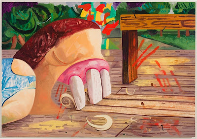
| Carpenter 2010 Oil on canvas 50 x 72 inches |
The painting I really wanted to show here is "Licking a Brick" from 2011 which is owned by Nina Grill. Who is Nina Grill and where is there a photo of this painting? Well I'll get a photo of when my catalog is delivered I suppose.
Much like in "Carpenter," "Licking a Brick" sends the viewer a direct snapshot from Schutz's brain of an impulse she has had. I've always been intrigued by these impulses, Where do they come from? What do they mean? How much do I really want that? I equate Schutz's impulses to scrape wood with her teeth and licking bricks with my desire to throw myself over the upper level railing at the mall and chuck my phone into the Biscayne Bay during an enjoyable conversation. I also often think about steering my car off the road while on the highway. These impulses always come at times when I am absolutely chilled out, I dont really want these things, I'm just impulsively curious about the experience and it kind of freaks me out. What if my action followed through as quickly and unexpectedly as my curiosity arrived? I love Schutz's ability to capture these fleeting thoughts into these sometimes gigantic paintings. They are simple and quick thoughts that she manages to translate into complex and time consuming objects while not changing their impulsivity a hair.
Some of the paintings that gave my eyeballs a place to pack up and move out of my head to were:
 |
| The Breeders 2002 Oil on canvas 84 x 90 inches Collection of Gagosian Gallery |
 |
| Chicken and the Egg 2003 Oil on canvas 75 x 90 inches Collection of Diane and Robert Moss |
 |
| Her Arms 2003 Oil on Canvas Collection of David Teiger |
 |
| Gouged Girl 2008 Oil on canvas Collection of Carlos and Rosa de la Cruz |
I loved the play of thick and thin paint in this piece. The orange splash of color you see between the girl and the bottle is one of the thinnest areas in the piece although it appears to be additive as far as color is concerned. That bright orange is such an intense color that along with its thin application gives the appearance of beaming, color as it's own light source, I love it.
Another area of interest I found was with the flesh colors on the girl and the watermelon. The color used is pretty similar and works as one color compositionally, but in reality it is a cool tone used in the fruit.
Schutz is holding it down and I'm glad that I got back on board with that.

I really enjoyed this entry. Very informative and beautifully written.
ReplyDelete